We are a small independent game developer located in Warsaw, Poland. Before The Astronauts, some of us worked on games like Painkiller and Bulletstorm.
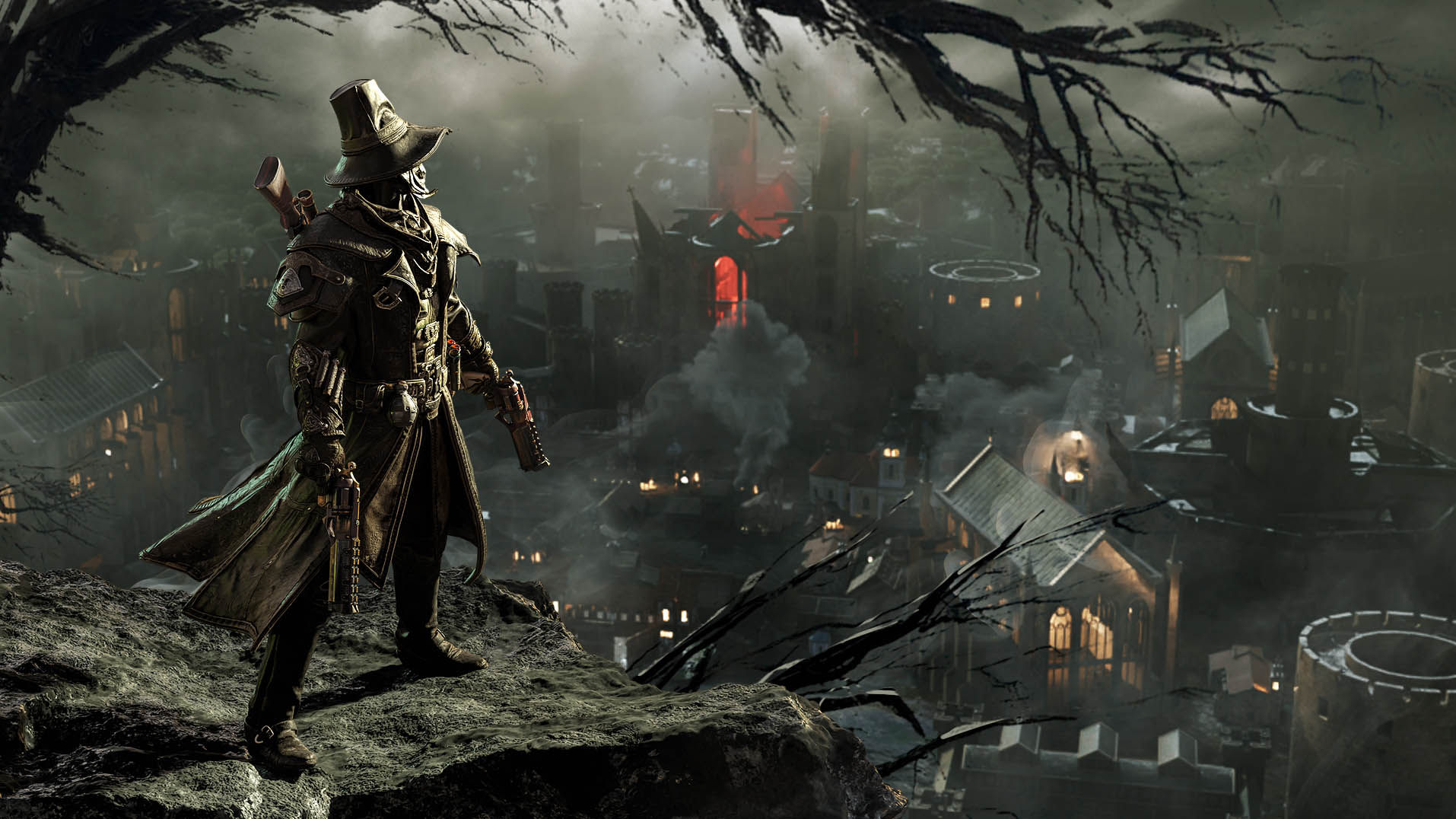
Our latest project is Witchfire, a dark fantasy first person shooter set in an alternative world in which witches are real and very dangerous – but so are you, witchhunter.
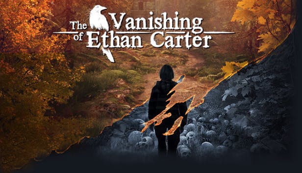
Our first game was a weird fiction mystery titled The Vanishing of Ethan Carter. The game has won many awards, including BAFTA, and we sold over one million copies. It’s available on PC, PS4 and Xbox One. Click here for more details.
Every day I see something cool implemented for the GGU — for those who don’t know, that is our first big Witchfire Early Access update — and the work is progressing nicely. But I know you don’t want too many spoilers, so this week let’s talk about something else: our key art.
The key art is, in short, artwork that represents your game.
The idea is simple but the execution is hard. For example, not only does the key art need to properly and enticingly sell the core elements of a game, it also needs to be universal enough to work both as a landscape format piece (widescreen wallpapers, featured store image) and a portrait one (posters, box cover, store carousel image).
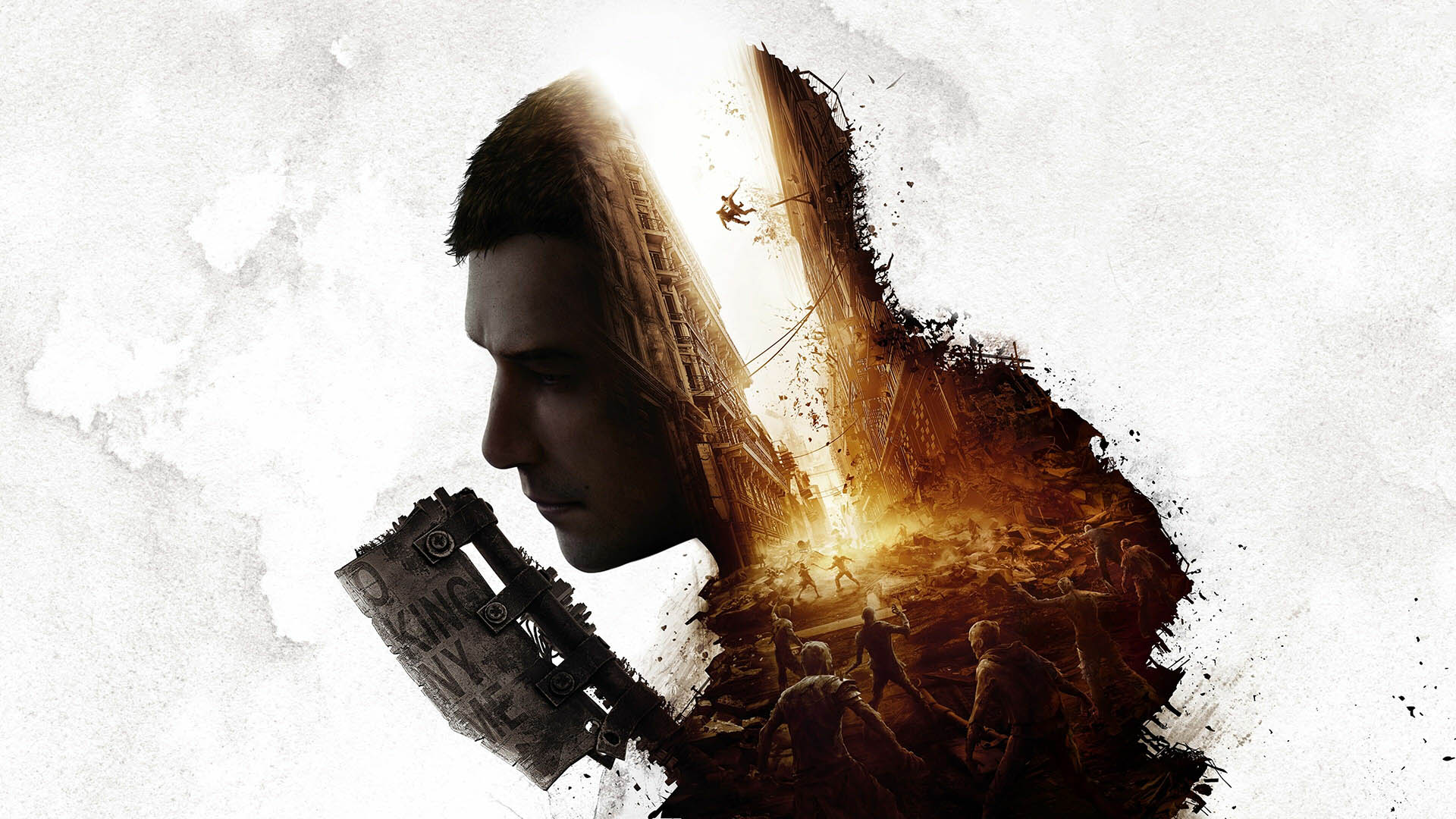
Let’s take a look at two examples of a good key art. This is Dying Light 2:
Think about what you see here. The dude, who from the context is clearly the hero of the game, has the biggest presence, literally. This emphasizes the solo adventure character of the game. Even though it does have co-op, we now know there’s a certain story to it, too.
We can see the road sign that also works as a cleaver, and that cleverly mixes the themes of post-apocalypse and melee weapons that are the dominating type in the game. The hero silhouette is split in two by a city street full of zombies, with some of the action taking place high above. This is to sell the general theme of the post-apo invasion of the undead and the whole roof-running, building-jumping parkour feature of the game.
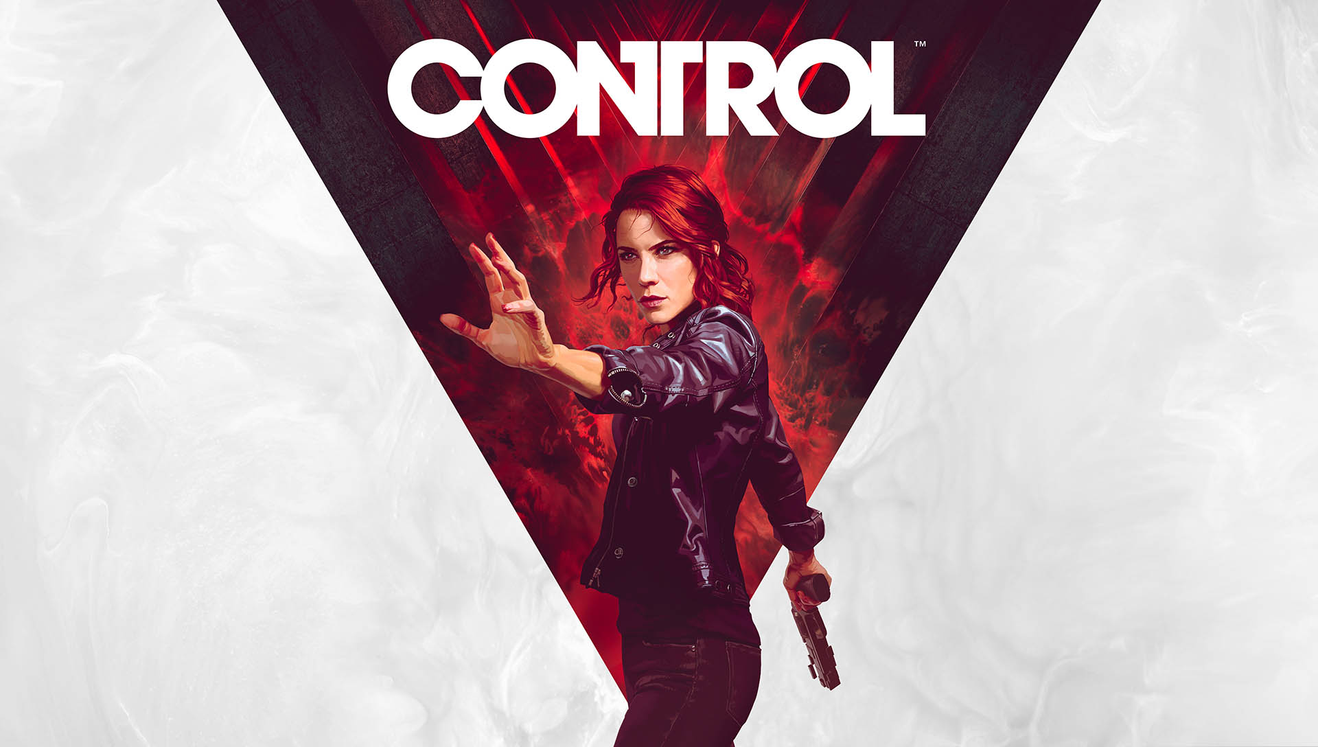
This is Control:
Accidentally, also a lot of white unused space to let the eyes focus on the message. We can see a woman quite confident in her pose, with a gun in one hand and a “spell” in another. We have immediate thoughts of Jedi and telekinesis. The woman seems to know what she’s doing, and together with the title – Control – it gives us the impression of a bad ass lady ready to kick some alien ass. Wait, alien? Yes, at least that’s the vibe that the red background gives me: of some type of alien invasion.
Dying Light 2 key art nicely explains you’re going to be a post-apo survivor fighting zombie hordes with makeshift melee weapons, while Control key art tell us it’s a game about a modern witch facing some horrific alien shit.
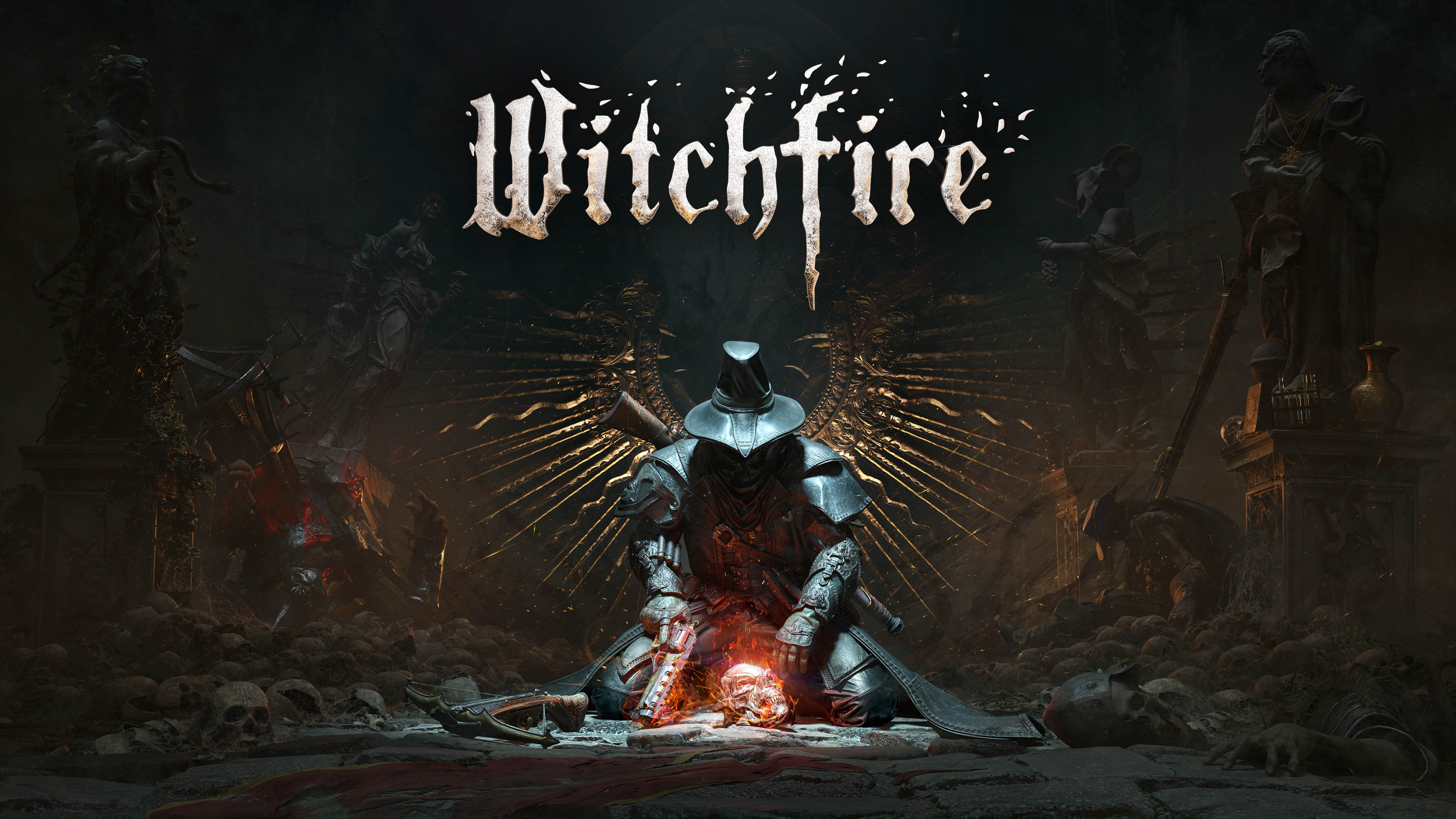
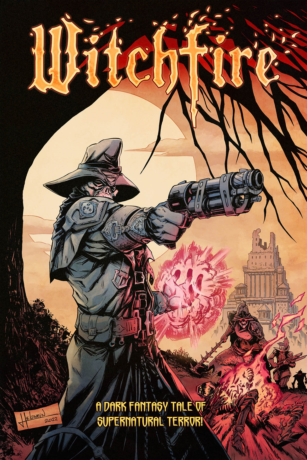
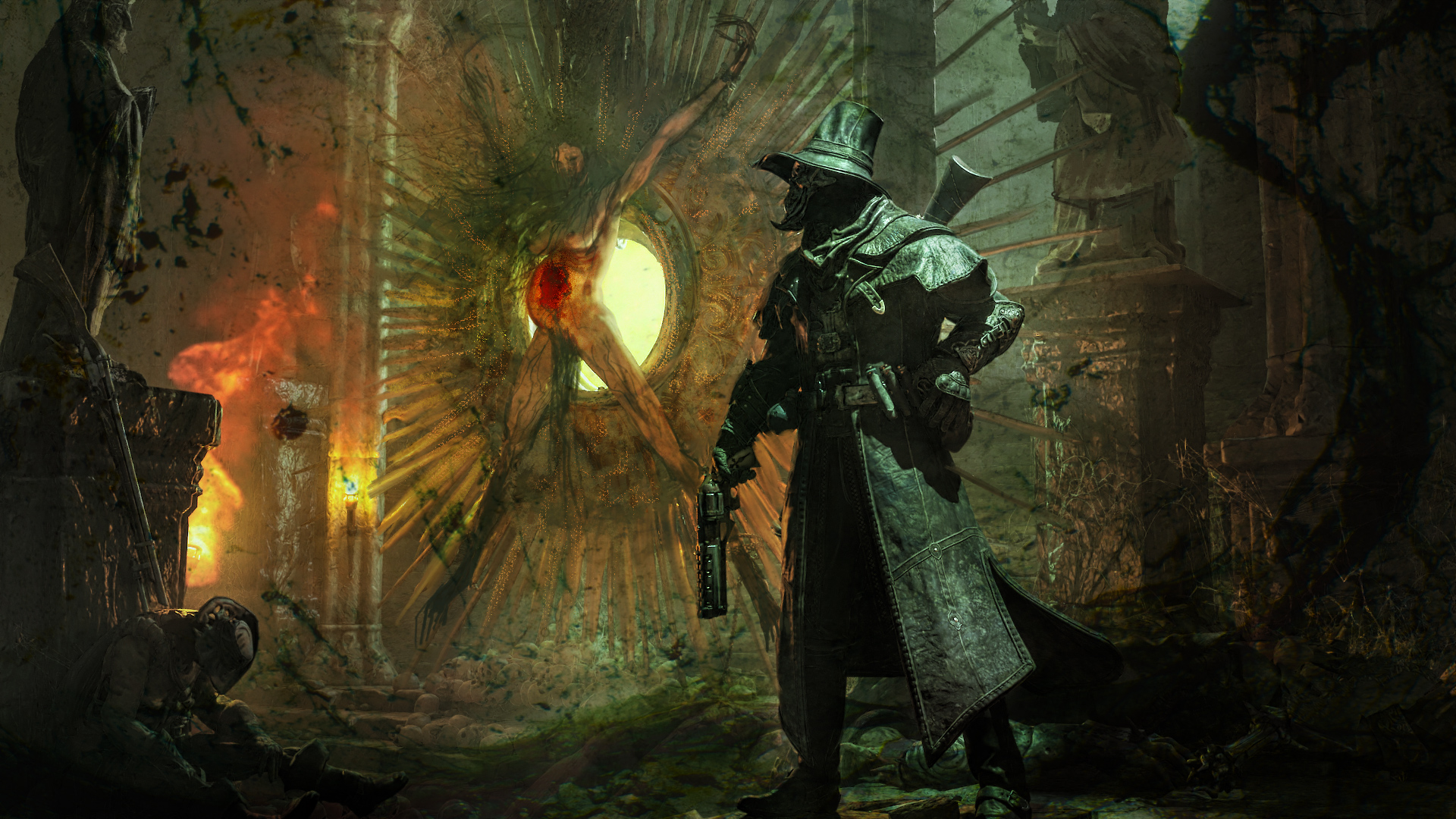
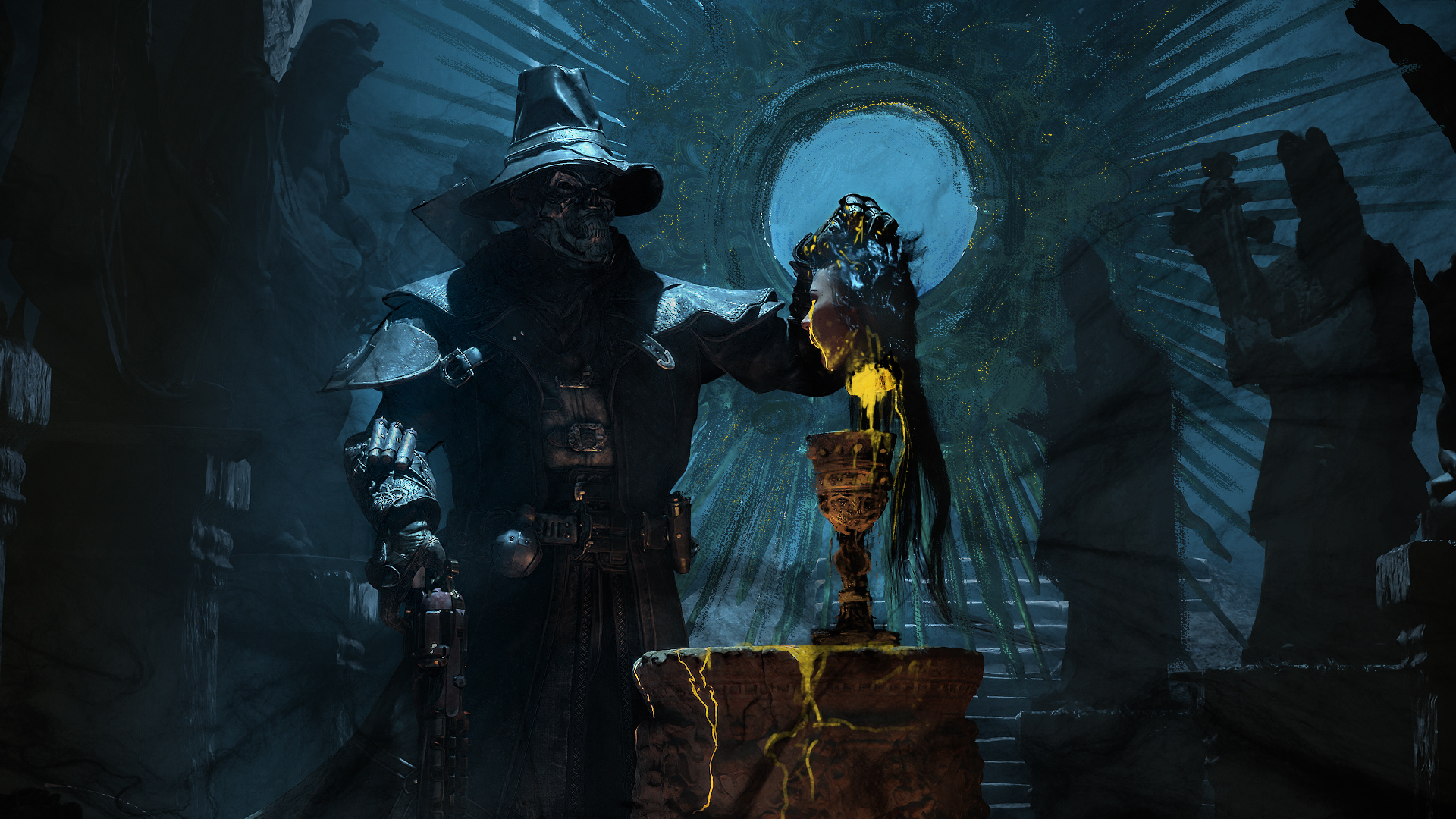
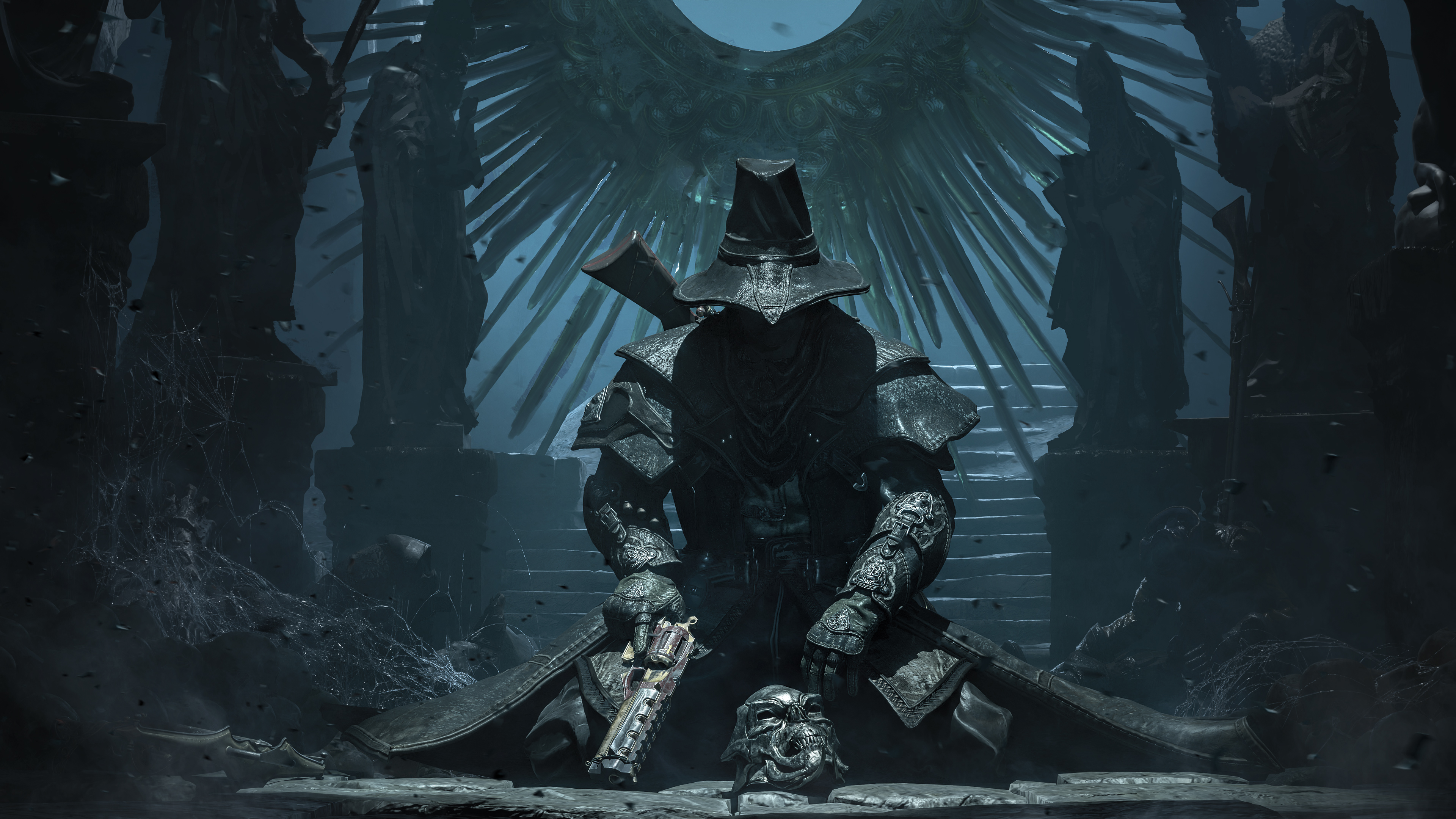
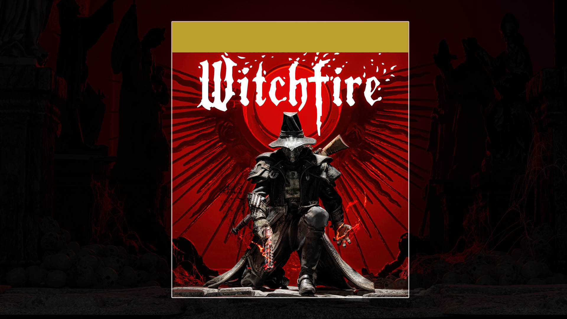
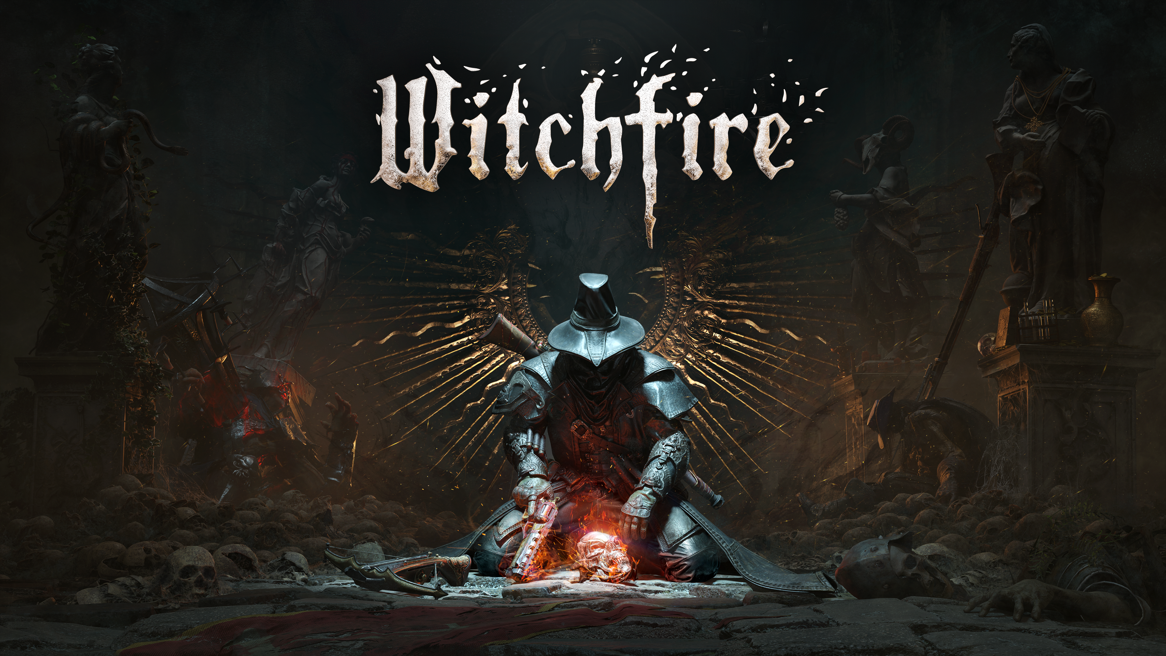
And now, for reference, here’s Witchfire key art.
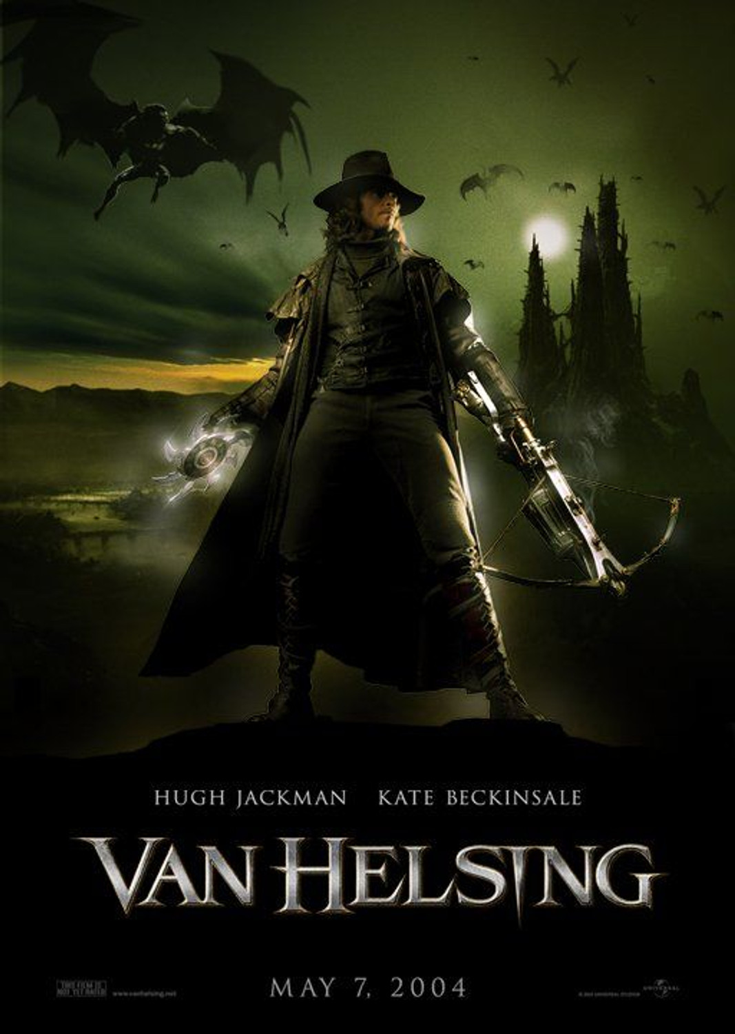
You’ve seen this archetypal design of a “dark long coat and a hat” before, be it Van Helsing…
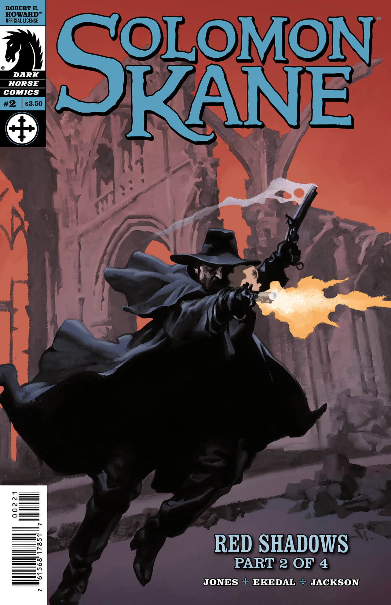
…or Robert E. Howard’s Solomon Kane…
…or quite a few others, like Zorro or Alucard of Hellsing. So by looking at Witchfire key art, you immediately have that mental connection to lone vigilantes. But — most of the time they are presented in a dynamic, combat pose. Something like this:
Meanwhile, our hero kneels down on some temple’s floor as if beaten, tired, or meditating. Why?
You do see the gun, so it’s clear what kind of game it is, but you don’t see the face at all, which is a very rare thing when it comes to hero posters. Why? There is a creepy glowing mask on the ground. What is it? The monstrance in the back sneaks in the religious undertones, but do the monstrance arms give our hero the wings of an angel, or a fallen angel?
Then, when you look closer, you’ll notice the four statues. What are they? Why are they here, what do they mean?
The goal was to raise these questions but not answer them. First, that’s not what the key art is about, but second, more importantly, we did want the vibe of mystery, of the unknown, of the creepiness. This is emphasize the fact that Witchfire is not just about pulling the trigger and clicking heads, but there’s also depth to it and the world that we deeply care about.
How did we arrive at such key art?
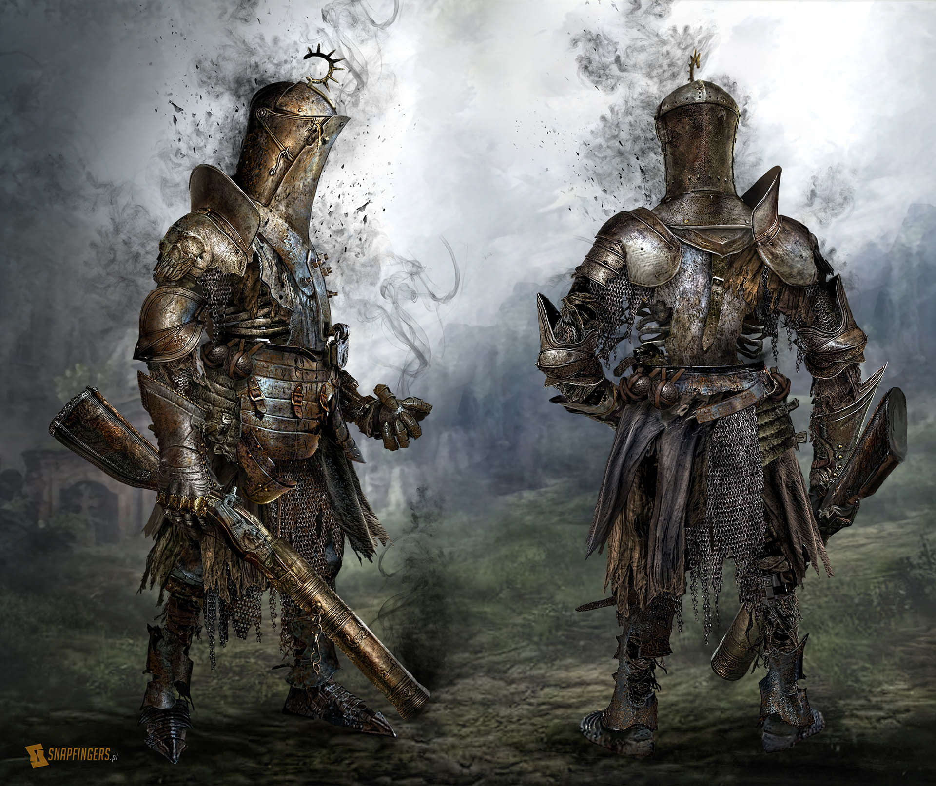
We do not have the resources to create something like this ourselves but we do know people who can. Snapfingers has done some amazing concept art for us before, like this…
…and they specialize in key art, so we asked them if they could create one for Witchfire. This is a pretty busy studio but luckily for us they like the game and agreed to make what we needed.
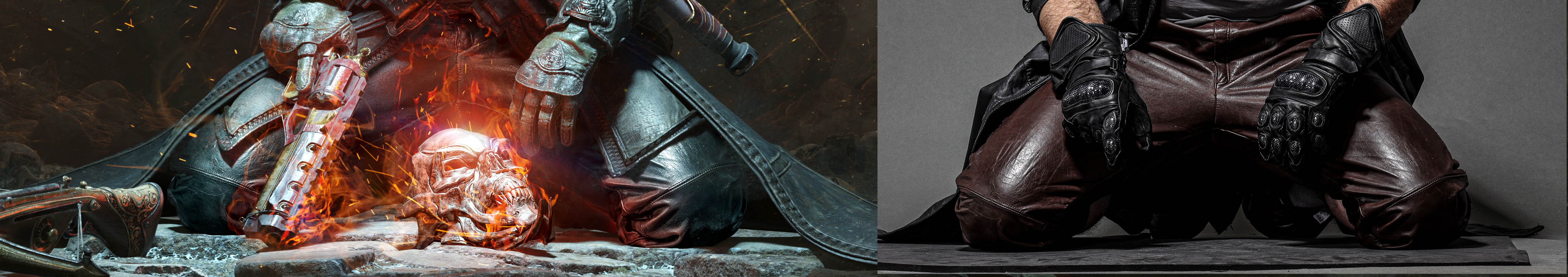
Even though I knew they were fantastic, I did not expect such a level of professionalism and help they have to offer. I wish every developer could find a partner like this. For example, while we had the 3D hero model – of course – we didn’t really have the time or resources to make various poses for him. But that was not an issue for Grzegorz Pędziński, Snapfingers co-founder. He posed the character himself in whatever software he’s using, but also went above and beyond to make sure we got enough proposals to choose from …by, for example, wearing leather pants, photographing himself in said pants, then mixing the photo with the art…
To give you an idea of what it takes to create a good key art, let me just unveil a part of our process. Here are select ten — out of twenty two! — first sketches we got. I will comment on each explaining why it was not chosen for our key art. Remember these are quick mock-ups, to be evolved and improved later.
Sketch A
We told Snapfingers we had no taboos, and they went all the way. But the messaging was unclear. Is this the witch, or the victim of the witch? The claws suggest the witch but then what is she even doing? Is she hanged? Attacking? What is happening to her? And why is she pregnant? How does this matter to the story in the picture?
Too many unanswered questions but more importantly, we were wrong in telling Snapfingers to go all the way. Looking at that image I realized… Yeah, no online shop is going to put that on display.
Sketch B
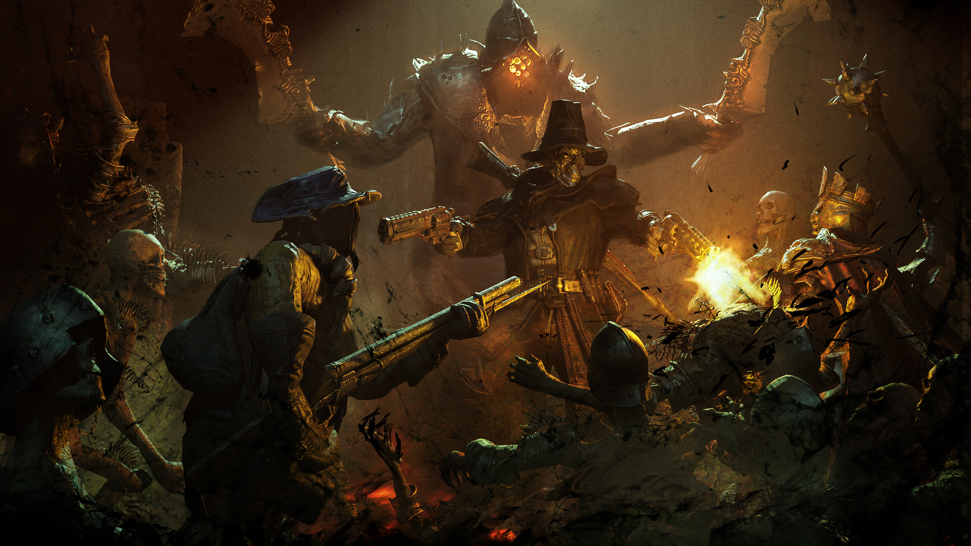
This one is pretty cool and safe. A lone hero facing overwhelming odds, with some guns but also lots of cleavers, swords, and maces. Gaslamp fantasy vibes, where guns meet magic. The problem is, though, that it sells Witchfire as a game to mow down waves of unrelenting enemy hordes, and that’s just not what the game is. We do have some sweaty, wave-based combat scenarios, but the player also does a lot of planning, thinking, and calculating. This does not look like a game that has a lot of space for that.
Sketch D
Same story as above. Out of this sketch we could do an amazing piece but the messaging would be wrong. I really like it, it gives me a cool, stylish “Diablo with guns” vibe but yeah, Witchfire is something a bit different.
Sketch E
This one was the first one to go in a different direction, with more mystery than combat. Maybe this is where we started to warm up to the idea? But the problem was: what exactly is happening here? We have some Indiana Jones vibes – when he swapped the idol for a bag of sand, and the Holy Grail standing on the stone pedestal – and some Hamlet vibes, which are suspicious in themselves, but what is the hero doing with this head? It looks like he’s dipping it into the cup …to soak it with some weird substance ….to do what with it?
Sketch K
Another one I love. I love the mood of it. Feels primal, pagan. The stakes are high, this is a duel of admirable opponents. But — this turns the witch, I mean, I assume it’s the witch, into a flesh and blood monster you now expect to meet in the game in exactly this shape and form. Even if this is not the witch, we don’t quite have an enemy like this. We could create it but then why would we make it so iconic that it deserves so much key art space? Too many questions to answer and issues to solve.
Sketch M
I like that “fuck you” message this gun and pose send. It makes it clear our hero has seen some shit in his life and is not afraid of the witch. However, it’s bordering on funny or edgy, and this is not the vibe we wanted for the key art.
Sketch O
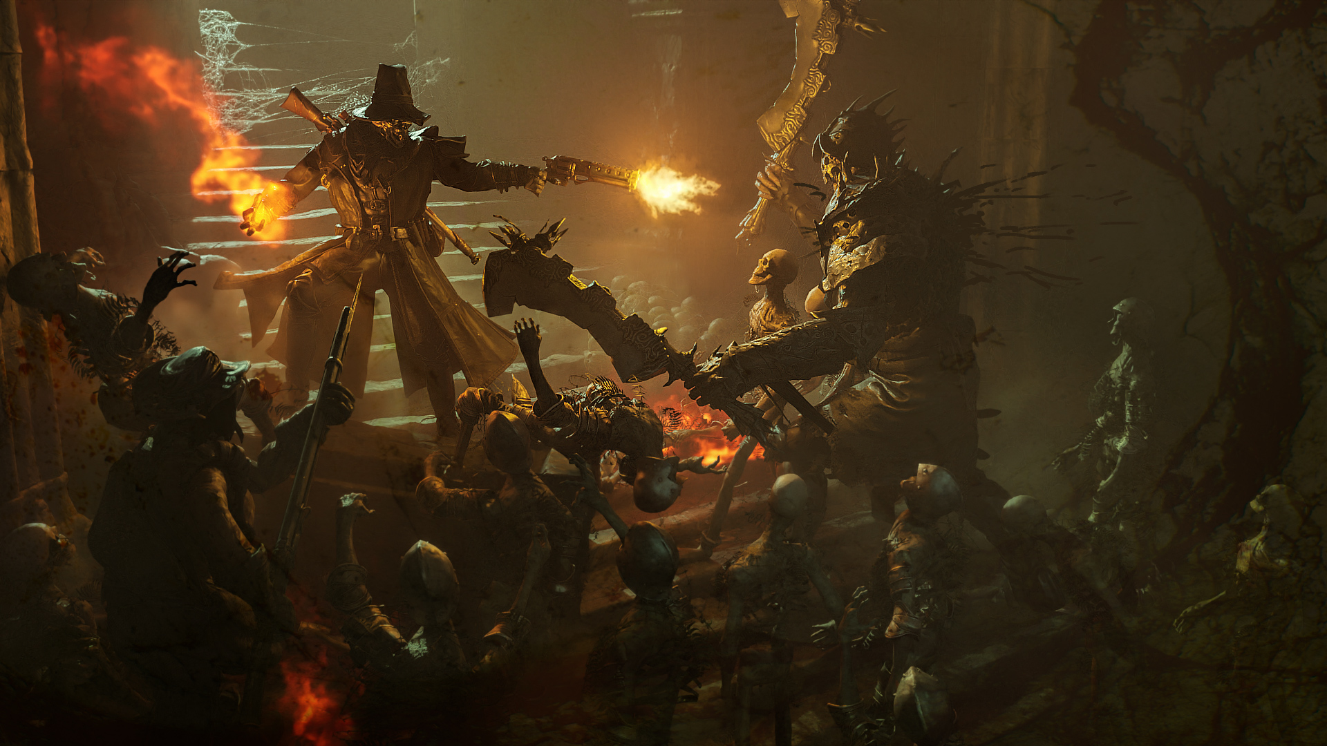
Another interesting idea for the witch but I guess by now you know why this one didn’t make the cut: too much action.
Sketch U
I love this one so very, very much. For some reason, the view reminds me of the opening scene of the Vampire Hunter D: Bloodlust anime, and these are some of the best visuals ever created. The mood is right, there’s some mystery here, a hero not afraid of the challenge and yet in over his head. You look at this image and start telling a story in your head, which is a wonderful thing.
Alas, I was afraid this would promise the players that vast cities await them in the game. While we are semi-open world with really huge maps, we’re not that big.
Sketch W
Back to edgelording. This scene is more intimate, and that’s good. It makes our hero an anti-hero, shooting a pregnant, seemingly defenseless witch point blank in the head. That’s fine from a lore point of view, this is a cruel, harsh, grimdark world. But …what’s the story here? Where’s the challenge that awaits the hero? What does this leg up in the air make him look like he’s dancing? And, once again, why the hell is the witch pregnant?
Actually, it might have been my idea, I can’t recall. This way or another, we just felt this is more confusing than mysterious.
Sketch X
That was it. Sketch X, literally the last one in the batch. The whole team fell in love, and the rest is history.
I mean, to be clear, between this and the final version there were a few hundred — yes, you read that right — permutations and versions of it. We explored various poses, like this…
…and we tested colors, lighting, head tilt and dozens of other things. Ultimately, we landed quite close to the original sketch, but well…
We shall not cease from exploration And the end of all our exploring Will be to arrive where we started And know the place for the first time.
T.S. Eliot
Oh, and as for the question asked in the subtitle to this post’s title: why do game developers need key art? In short, you will be using in everywhere. Online stores, portfolio, webpages, blog posts, etc. etc. For The Vanishing of Ethan Carter we’ve created its key art quite late, just because we could not function without it anymore. For Witchfire, with our lesson learned, we made it (and by we I mean Snapfingers with our feedback) before the Early Access launch.
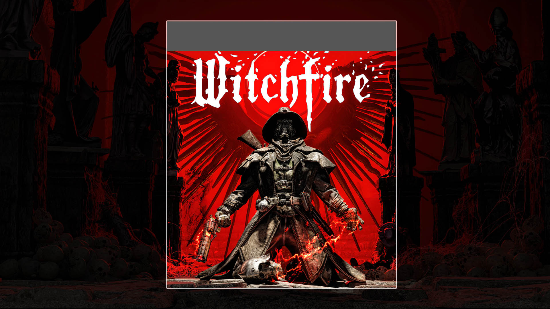
Last but not least, if you want it, here is the 4K version of our key art. Logo version and no logo version.
Till next time, where I go back to GGU things, I believe.
Question of the Week
pls dont make it easier.. i was happy i found a difficult game again. But we need content :c
Content is coming. As for the difficulty, it’s a very, very tricky thing. But here’s the message we want to send to everyone reading this: whatever changes we are doing, we are doing them to make the game better, not easier. Some changes might look like we’re making the game easier but you’re looking short term, at an isolated section or feature of the game. Top level, the idea is still to make a game that challenges you the same way From Software games challenge you.
Actually, this gives me an idea for one of the future blog posts because there’s so much more to say here. But for now, again, don’t worry. You’ll smash your monitor and break your keyboard soon enough, we promise.